


Project No.1 Spiced Fruit Crunch.
My idea for a mini final major project is to do a mock recipe advert/demonstration. Instead of having a proper recipe I will have a nonsense recipe called Spiced Fruit Crunch. I am thinking of having only a few images which may include the ingrediants or perhaps just the recipe written on a piece of paper. the story and the humor will come from the sound effects.
For example I was ocnsidering a few lines which I could use. One line was 'Be careful not to burn yourself' and in that moment I would have a small sizzle sound followed by 'Ow F%$*!!!'
The narration will be the person following the recipe but failing, exclaiming his frustrations and problems as he goes through it, until the end where the only video piece will be him all bloodied up and in total chaos as he finally succeeds in finishing the recipe and eating the food only to find out it tastes horrible.
Inspiration came from watching a few Monty Python clips and a Two Ronnies sketch which many include nonsense and british style slapstick comedy and wordplay.
The recepi will be narrated, I will have to find someone with a posh accent too add the juxtoposition between the posh voice and nonsense instructions. The sound effects of what is going on will be placed over the narration. I am considering what to do visually, perhaps I will keep the entire thing in darkness and let the audience build a picture for themselves. Or maybe I will place a lot of single frames with pictures of the nonsense ingrediants.
Initial ideas for the BBC2 Indent Logo.
My first idea that immediatly came to mind was to do a massive chalk drawing of the BBC2 in a public place with an overhead shot and see how many people walk over it or avoid it completly. However the first problem I encountered was that, at the time of writing, it is currently wet outside and near impossible to draw a chalk drawing on the floor until it dries up. However I am hopeful that because it is sunny outside that the ground wil dry up. I could have also done a chalk drawing on the college grounds with a panning shot from inside the college to looking out the window and seeing the massive chalk '2'.
I got my other idea after coming back from the canteen with my breakfast. I was going to have a montage of close up shots and general goings on in a classroom. We see a young man putting ketchup on his bacon bap and when the camera looms over his shoulder we see he has painted a '2' with ketchup on his bap. Tim pointed out that while this was a good idea however difficult to shoot right to make it last 30 seconds and be shot well.
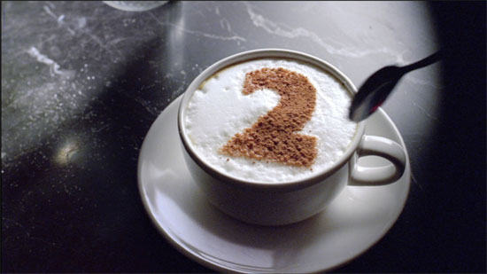
I have seen a few BBC 2 indents from the 90's and I love them, the ideas are very artistic as well as visually pleasing. The soundtracks to most of them are quirky and interesting. I particuarly like the indent where a large 2 falls on to white powder revealing a blue powder underneath that. (See video link above.) I think the soundtrack is a key part of the success of this ident. The obvious sound would a whistle of wind and the thud of the '2' hitting the power. I think the director would have found it too obvious. The audience would expect this, and therefore there would be no surprise. The designer would have the job of bringing suitable drama and impact to the soudtrack. I believe that the sound is of a gong being played backwards, or the later stages of the gong being hit. The 'impact' sound is a gong being played at normal speed and the powder flying in all directions is the the same noise but slowed down with added reverb. I would have considered a 'crunchy explosion' which would add humour. The fact that I have strong views on this is a clear indication of the power of this logo.
If I was to do a similar idea I would have the 2 fall on to white powder revealing a multiple colour scheme of powder underneath that. Or perhaps a wooden 2 falling on to a seemingly clean surface, maybe white powder, and underneath the surface is multi coloured paint which would, in theory, splash outwards when the 2 fell upon it.
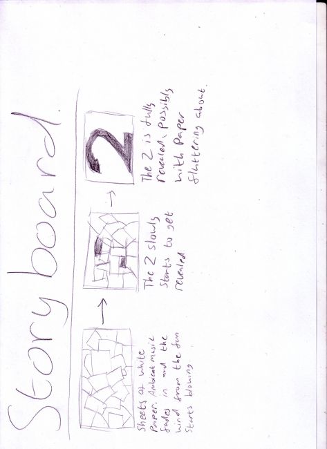
Further ideas include having a black '2' drawn on a few pieces of paper, and cover that with white paper lightly held in place by sticky tape or a tiny amount of glue. I would then blow a high powered fan that would blow the white pieces of paper away bit by bit revealing the 2 completely after a short while. I would need a strong fan because I plan to slow the footage down and add some ambient music in the background. This seems to be one of the ideas that seems possible in the short 2 day time frame we have.
Brainwave! I have two ideas I can do, the idea above and what I will call the 'fridge note' idea. The first shot will be someone writing a diary entry or a reminder on the post it note then sticking it to the piece of card. Pulling out we will see that the notes will form in the BBC 2. I wa sdwondering whether to already have the post it note 2 be complete or whether to start with nothing and over time have the students and myself slowly build the post it note 2 and speed up the footage to see the full formation of the 2 in about 20 seconds.
I decided to go for the idea of having the BBC be drawn in by multiple hands. After setting up all the quipment I, with some help, managed to recruit a few students to help me. There were a few problems during the filming, for example shadows kept obscuring the 2, peoples hands could be seen leaning on the paper and occasionaly the top of someones head would come into shot. I made sure to try and direct people on where to draw, during the shot there was a single area of the 2 that was not coming up so well on the film so I instructed two students to swap pens and the problem was alleviated by a darker color highlighting the lighter parts of the 2. Directing people was harder than I thought because either they forget to heed my instructions or I was simply not aware that problems were happening.
In the post proeduction however after I sped up the footage to 4000% its regular speed you could barely notice any of these problems and the project as a whole smoothed out nicely. With Tims help I managed to change the colours on the BBC logo and the 'Subtitles' part in the top left. Because the subtitles was in white on a white background you could not see it, so after changing the color in photoshop I placed the image back in. Using opacity keyframes the BBC 2 logo and the subtitles faded in rather nicely and in time with the production. Now I just need to think about the audio to go with it.
I have thought about putting a rather nice ambient soundtrack to the back whilst at the same time adding my own sounds of pen scratching and marker pen noises. I do like the mid 90's soundtracks that most of the BBC 2 indents had at the time, perhaps I could warp the original soundtrack to make it a little bit more abstract, make it more of a sound painting than a soundtrack.
The old BBC 2 ident which was showing around the year 1986 was, as desribed by the public, 'Boring' Middle-class' and 'snobbish'. I agree with these comments as the bland colors and lacklustre design seem uninspired and with what BBC2 was trying to be, a less mainstream channel catering to minority interestes and tastes, it just doesen't make sense as to why they would choose something so plain.
'I realized that the TWO identity was a problem as soon as I took over the channel. It was obvious that the logo made absolutely no impact. It was singuarly unmemorable and it told you nothing about the channel.' (Former controller of BBC2- Now director of programmes, BBC television Alan Yentob.
By the 90's the TWO logo had been redesigned into something more witty. Many idents were created, each of them unique and interesting. Audiences reactions to these new idents were a complete turn around. BBC2 was no longer 'Boring' or 'Snobbish' but it was now 'Sophisticated, witty and stylish'. I personally love the BBC2 idents that ran through the 90's and early 2000's. My faviourite is the ident which was a mettalic 2 falling down away from the camera and landing on a a bed of white powder, however as it lands a light blue powder bursts from underneath and the differeing lights changes the color of both the 2 and the powder.
With the new idents BBC2 it was seen as 'far more accessible and entertaining than before'
Martin Lambie-Nairn was hired to create the new design of BBC2 and in his book 'Brand Identity for Television With Knobs On' (Phaidon, 1997) he talks about the design process in which he believed that, after doing research on public reactions to the old idents and after having begun designing new ideas, 'We felt that the brand values BBC2 had to convey- witty, innovative, surprising- could not be communicated effectivly by a single ident. I imagined, therefore, a whole family of idents which could be developed in a variety of ways to reflect the different programming moods of the channel'
I agree in that a single ident would not have been enough to make a sure impact on the audience and that a number of interesting and artistic idents was the right way to go. Im sure we can all pull out our faviourite ones from the bunch and appreciate the rest. I think this marked an amazing turning point for BBC2.
TV/FILM SEQUENCES
TV Title sequences
Generally a tv title sequence will last anywhere between 10 and 30 seconds, there are exceptions to this but for most cases this is the accepted time frame to introduce the show. However a few of my most liked title sequences like X-files and Dexter last a little longer. I believe that tv title sequences are generally on the shorter time frame to help imprint a sense of familiarity on the audience and so it's short enough to not make watching it tedious.
We see title sequences at the start of the tv show, while it sounds redundent to say so it is a fact. The title sequence of a tv show helps set up the premise of the show so newcomers can get the gist of what they are about to watch and also to imprint certain visual and audio ques to the viewer to help them recognise and remember what the show is. Because it helps the show stick in their mind it makes it easier and more likely that they will introduce the show to friends and other people.
The show is about independant films, modern art and contempory art. The show is narrated but never has an actual presenter, it is a collection of short documentaries and 'behind the scenes' look at modern art with the artists themselves discussing their ideas.
The idea was to create a parody style intro, inspired by the South Banks Show. However instead of doing it seriously it would be a parody with alot of artistic stereotypes.
Shopping list of potential shots:
Mime-montage
Water drop
Reaction shots
REVERB
Black and White
Grainy footage
Historical images juxtaposed against random objects
'Dreamy' effect. Blurry, Misty, Foggy
Photoshoped historical images eg. Hitler with a melon for a head
Slow
Pompier, Pretentieux -Potential title. -French for protentious and poncy-
Circular, spiral
Photograph
Emotions
Research-
Adam and Joe show 4od
Nathan Barley- Chris Morris, Charlie Brooker 4od
David Bowie videos -Ashes to ashes
Shopping list of shots.
The shots of the 'art' have been edited in photoshop to make them more garish and vibrant. These shots will be cross faded among other shots we will compile, making it both dreamy and erratic at the same time.
Imposed over the top of everything will be a pair of lips, partly transparent, which will recite the lyrics of the song as it is playing. After the singing itself has finished the lips will fade out and in it's place will be the title of the show, simply with white text and a black background. This will make it easier for the show to begin as the white text can fade to black and then the opening frame of the show can fade in.
I think that the opening title sequence will have an 80's feel to it, after having watched a few David Bowie videos that came from the 80's and other such material I think that the 80's arty vibe will work really well. The high contrast images, as well as the vibrant colors and so forth, plus the dreamy astheitc of the soundtrack and editing will be interesting to see. the juxtoposition between high contrast color and dreamy blurry visuals may not work well together but I think it will be just right for the type of show that this title sequence is for.
FINALLY COMPLETE!!!
The work is finally done, now I just have to write everything up, yay :D
Well the final product wasn't exactly what I wanted, but then again to get it to the level of polish and professional swagger I would need to work on it for maybe another two weeks non-stop. But I feel rather pleased with what myself and James Mingo have done in the end.
The final product looks just as much as ive said previously, a series of high contrast images cross faded together with a pair of lips imposed over the entire thing. Once this was done I thought that the next thing to go on would be the lips however instead Tim had a look at my work and said that it was missing something, he then showed me a way of using the other images I had not used yet. I placed them on another video layer and put the luma key on it, taking away the white and black where needed to leave just the striking color. With that done I then set two motion key frames so the image would move from left to right, with a little bluring the images then looked like 80's acid culture mist which was a nice touch because it compouned the dream like effect of the piece.
Mingo arrived later on in the day and he had a look at the project, which was still incomplete and missing a few polishing touches. We filmed one of our friends doing the lyrics for the imposed lips, i thought that the best thing to do would have been to get someone with a clear complexion, no facial hair, spots or anything like that and use them for the lips. I would have also put white make up on their skin and lipstick on their lips so I could have taken away most of the head in the post-production and left just the striking color of the lips. If I had more time I would have done this. In the end we picked someone else to do it and we notcied a problem.
The model we used had not heard the song before so we wrote the lyrics on a sheet of paper for him to read. Even after he read the lyrics out and we took the footage to Adobe premiere we immediatly noticed that the lip syncing was not perfect. I thought this might add to the effect of a dream like state however after watching it a few times I found it to be frustrating that the lips did not match the sound correctly. Mingo assured me that he could edit the piece so that the lips would sync and while I do not doubt that he could do that given enough time, I wanted to make it so that there was little effort involved to reduce the stress that a tedious task would bring. Saving time was also a goal for me. In the end Mingo suggested that we film his lips, he knew the lyrics and the general speed of the song since he had been the one to edit the soundscape in the beginning. To make double sure we would not have to go back and film it again we asked a friend to play the sound loud enough so Mingo could hear it in the corner where we were filming.
With the song being played in the background Mingo was able to sync his lips with the song perfectly. After importing the footage, making sure it was synced, making the image black and white and placing the luma key so we could take away much of the face, it was completed. The basic plan for the piece was done and all that was needed now was the polish.
Mingo suggestd that at the end we place a sort of signature for the title of the show, to add to the pretentious nature of the show and the sort of subtle self parody. After placing the title of the show in a swirly font, and adding a little more flourish with the pen tool, we faded that in at the end and the project was officially over.
FINAL MAJOR PROJECT IDEAS AND NOTES.
Ive decided to start jotting initial ideas, thoughts and notes for my final major project here even though it is a few weeks before we start the project. I might keep a diary here for variety...We'll see.
Tuesday 1st March:
Ever since I joined college about two years ago ive always wanted to do a spoof kung fu movie with bad lip syncing, cheesy voice acting and cheesy B movie fist fights. However actual college work has prevented me from doing such a task but it has alwasy been in the background of my thoughts ever since I began this Film course and now seems like a good time to hammer this idea out and pour as much effort and time into it as I can. Initial insperation for this piece comes from an early 2000's movie called 'Kung Pow: Enter the Fist. The director of the film, Steve Oedekerk, took footage from a 1976 Hong Kong martial arts movie, Tiger and Crane Fist, and edited himself in place of the original actor as well as dubbing the voices of the cast with silly voices. The film parodies alot of Kung Fu B movie trends like terrible lip dubbing and cheesy fight scenes.
This film has plenty of funny moments in it and unexpected dialogue, for example the lead character calls the heroine a 'sadistic psycho bitch' after she pours mercury into his wounded palms and explains her reasons for doing this were to give him strength.However the movie itself did not do very well in theatres but since it's release it has gained something of a cult following. I will add a critique of the movie later once I am able to get a copy of it.
I want to do a small movie production, perhaps in the five minute to ten minute range, which parodies and points out and explores alot of the stereotypes, flaws and archetypes of a classic Kung Fu movies.
Even as I begin thinking of this I have started to formulate some questions I need to answer: What is a Kung Fu B movie? Does the age of the film inspre the style? Eg. What are the differences between a 60's, 70's, 80's, 90's and more modern Kung Fu movies? Should I go for serious or parody? What are the different sub-genres of matrial arts movies and I will need to look at the martial arts genre as it was in the past and today. I will also need to reserach the parody style of production. What is it that makes a parody movie?
Then I will need to think of the actual production. Old Kung Fu movies have a certain feel to them which is probably due to the types of camera and film they used. Should I try and get ahold of some of this equipment for myself or should I do all the effect in the post production? Should I even go for an old grainy film look or should I persue a different style altogether? Even though I am making a B movie martial arts production should I even go for the style of an old 80's movie or go for something more modern like The Matrix?
I will need to look at alot of old and new martial arts movies and do small critiques on each of them, I can see the fight coreography being the hardest thing to plan.
Since we only have two months to complete out project in, a few weeks in practicality since alot of my time will be spent researching and planning, I think that the fights will be the most time ocnsuming thing to plan. I will first and foremost have to think of the health and safety aspect of things, me and none of my friends are actual actors and by extension none of us are stunt people, nor will I be able to reach out and find these people to film with so using my friends and those close to me is the only option. However I dont want to actually hit my friends nor them me, so I will have to think of ways to keep the fight scenes interesting and comical, if I go for that route, without actually hurting anyone.
Also I will need to consider the use of props and more specifically weapons. Should I bother using them? Or go without weapons and make the movie a straight up fist fight? The inclusion of weapons would make things more dangerous unless I plan correctly, then again it may be a needless endevour because I will need to decide if weapons are necessary or if planning and including weapons in the fights scenes will be a waste of time and resources. And considering I have little time and little resources I will need to decide quickly what to include in my movie.
I have already made the decesion to be on my own in this production. I want to create a final major project that is purely of my creation and not someone elses deas influencing mine. I want this production to show off both my strengths and how I overcome my weaknesses. This may be harsh to some of my friends who might want a significent role in the creation of this movie, and I will take their advice on board however the final decisions on this production will be mine.
MOVIES THAT NEED TO BE WATCHED AND CRITIQUED:
The Matrix trilogy
Kung Pow: Enter the Fist
Fearless
Unleashed
Ong Bak
I will need to watch some older movies too, I will include any pages on the internet that directly relate to them like Wikipedia articles and other pages of the sort.
After speaking with Tim briefly and telling him my proposel he was concerned that the final production of my project would seem too much like a 'student' piece. I share his concerns and he has offered an alternative which I can then develop. He suggested that i look at how movement and the human form is conveyed and presented in martial art movies and I am thinking about how fight scenes are shot, how each frame is pictured and how the camera speeds up and slowed down.
I want to portray a 'fight scene' but more internal, like what a person goes through in a fight. Unlike how we normally see in movies and tv fight scenes are not clean and coreographed, they are gritty, dirty and are driven more by emotions and instinct. However, as Tim pointed out, there is a sort of ritualistic feeling to fights, how people stalk and circle each other, a hidden code of ethics that can be noticed in fights and certain movements that are common. I am thinking about how fights on tv, especially in things like boxing matches and the UFc are shown, the opponents start off by giving and taking a few hits, doing simple moves and dodges to size each other up before they really get into a scrap.
I think the production will end up being like a soundscape, a piece of sonic art as well as a group of short video clips strung together to show a fight. I am still wondering on whether to clearly have a beginning, middle and an end although I think I will stick to this simple narrative to allow the audience to follow the piece more easily.
I will look at both martial arts movies and music videos as well, i think music videos will be a great source of inspiration to me as some music videos are heavily focused in the human form and human movement, i am thinking especially of music videos for songs by the band Moderat, especially Rusty nails and A New Error.
The production would be a collection of short video clips with choppy editing, we would see close ups of movements like hands clasping and fists raised to protect oneself, other martial arts movements and grabs. In the background would be an array of sounds like punches and heavy breathing but edited so they sound like the sounds are what a person hears, the sounds may become muffled or suddenly sharper at times depending on what is happeneing in the fight.
Also in the sound department I was thinking of having quirky sound effects, for example at the start of the production the fighters would be preparing for the fight, stretching and throwing a few ghost punches, tying on gloves etc. I also need to think about how the soundtrack changes as the fight drags on and when blows connect. I think looking at boxing films in particular will help since these movies generally feature scenes where we see the protagonist go through a series of blows and the soundtrack changes, im thinking of films like 'Raging Bull' and 'Rocky'.
After a conversation with Tim I have been thinking about asking people a few questions that may help in my research. Since I want to explore the 'Internal' thoughts, feelings, emotions, sounds, colors and so forth of a fight I thought it would be an idea to ask people about what they think of or go through in fights that they have had. In asking them to go back retrospectivly through fights they have had im sure they could tell me what they thought of, how sounds and thoughts were percieved and so forth.
I am wondering whether to show people a few fight scenes in movies and ask them their opinions on it, I am already thinking of two things to show them. A fight scene in 'Sherlock Holmes' starts with the main protagonist going through the fight in his head before acting out, everything slows down and he is in his mind. This shot is good because you hear the entire fight both in slow motion and normal speed, you get a feel for how powerful the shots are because of the sound they make on impact, not just the sound of fist hitting flesh but also bones cracking and the audiences reaction.
PRIMARY RESEARCH
After speaking to a few students, who have been in fights, I have managed to paint a picture of what goes through a persons head. The person in question said that he was not thinking clearly in the fight, there was alot of build up before punches were thrown so by the time they fought there was alot of built up anger. He said that everything was a little blurry and when he was struck in the head it felt blurry. He said punches dont sound like they do in movies, they sound more like slaps or cracks than a punch, he said that punches down hurt as much as you would think either although he was drunk when this fight happened, I will take this into consideration since in my production the people fighting will not be drunk. When he was struck in the head he said there was a dull throb.
This has given me plenty of ideas of what to use for sound design. I will design a questionare to hand out to people, with links to two fight scenes and ill ask their opinions on the scenes as well as other questions that will help me in thinking of what to use for sound and visual asthetic.
I think I will post a questionnare on facebook, I have the pages of a few students whom I can ask. I will include the links to the scenes and ask a few questions about it.
*After posting* I have posted the questionnare to a few people in the class, I am sure I have forgotten a few people I would like to ask but I will take them aside at some point and ask them individually. I have only recieved one questionnare so far and the answers have been a little vague and not very helpful, I think this is more my fault because of the vague questions. Still I sent out about 12 of these questionnares and even if I dont find the information helpful right then and there it all adds to my research which will help in the end.
MODERAT: RUSTLY NAILS CRITIQUE.
I feel slightly biased in favour of this music video because it happens to be my favourite music video that ive seen so far. It portrays the human form in a dreamy and expressive way. I can't help but feel sexual undertones as I watch this movie, but not in a vulgar way, more of an artistic, free and natural way.
The video starts off with a giant piece of white fabric being thrown around in circles, if you look cloesely you can see where the persons hand has been blacked out to make it seem like the fabric is moving by itself. Soon after we see a human form pressing against the fabric on the inside. The persons body shape, I think it's a male but it's hard to tell, is pressing against the fabric, pulling it taut over his body and showing the finer details of his body like his knuckles and spine.
I feel that this represents a featus growing in the womb, the form pressing against the fabric represents the babys desire to be free and to be born into the world. It is also about discovery I think, the form inside the fabric is inquisitive, looking form side to side and moving his fingers along the fabric to feel it.
At aboutt 1:22 in the video the fabric is being blown by an unseen wind machine, obscuring the person inside as the fabric waves and moves to the wind. The form seems to be struggling against the wind and using more energetic movements.
I think this represents a human being born and discovering the world for the first time which might be a scary and possibly painful experience so the human is struggling but finally acccepts the birth process. Then two forms appear under the fabric, a male and a female. We know it's a female because as the fabric is pulled and moved we can clearly see the impression of the womans breasts.
For me this represents more solid evidence about the birth, now we know whether it is a girl or boy but this video is not about a single persons birth, but rather the birth of the human race and thus both genders are accounted for.
At 2:08 we see and furhter we see the fabric being pulled and blown upon but now we start to see who is underneath the fabric, we start seeing skin and clearer impressions on the person, this is the part where we can certainly tell that the person now underneath is a woman. As the fabric rolls back off the person we see imperfections like moles on the persons back. I think they left these in and did not edit them out to show how the human form can be 'imperfect' but still expressive and beautiful.
This symbolises to me humanities discovery of the human form, perhaps his or her own or perhaps anothers. The fabric is pulled back leaving the skin bare, essentially allowing the audience to see. One could argue that this represents two people discovering each other in a sexual way for the first time as it's the first time the audience sees the skin of the actors underneath.
After a flash of red fabric, I think this could represent humanitys mastery or experience in sex since red means love, danger and passion which could easily describe sex. The cloth in this case would also back up the sex argument since people in high positions of knowledge often wear cloaks or coats, I am thinking of people like priests, wizards and doctors.
Now we the forms of fabric start to take more shape. The person is clothed in a hood and gown from the fabric, the cloak and hood covering his body is a different color than white, it is a dark green. I think this green now represents a persons teenage or young adult stage of life when he has all his energy, hense the energetic jumping and moving from the person in the fabric, and is enjoying his new life of discovery and pleasure. However the dark green shows that the person is not fully in control or fully knowledgable yet. Also I think the hooded cloak looks kind of like a hooded top that teenagers seem to like, myself included. The hood is a powerful symbol of danger, mystery and protection. We cannot see who is underneath the hood so the element of danger and mystery is most prevelent however the person underneath the hood would be unlikely to have a clear vision of the outside world because the hood is obscuring his view, thus he is protected against things he cannot see.
In the final part of the video the gown turns a clean white and the movements become less energetic and more controlled and flowing however the person underneath teh cloth still jumps about, just not as much.
This is a persons transition to masterhood and the end of his experimentation in his teenage years. Now he is an adult, or old man, and has less free energy in which to jump around, but he knows what he likes and what to do which is shown in his more controlled and slow movements.
Finally we do not see the person underneath the fabric again, instead we see the fabric flowing over what appears to be a window. This clearly, in my opinion, represents death. The person has had his life and now he simply wishes to rest in his final minutes. Thus the window becaus enow we can imagine that the person has chosen to die in a closed enviroment, possibly a house or even his own room. The fabric is draped over the windows and it covers the view, showing the shadows of the wooden beams of the window against the white fabric. The fabric slows down in movement until it seems to be still as the footage fades to black which represents the death of the person and the end of the human life cycle.
This video is incredible I think, there is so much symbolism and meaning behind it that isn't too obscure for someone to figure out or decide for themselves. I think the ways the human form is portrayed is brilliant, freedom with an undertone of sexuality. I will take from this video some ideas of how the human form can be portrayed, and even though I will be doing a fight scene I think that sex and violence can be translated on screen quiet nicely, showing off the beauty and expressivness in something that is actually quiet violent and ruled by instinct.
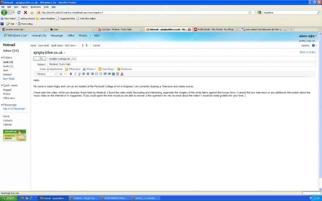
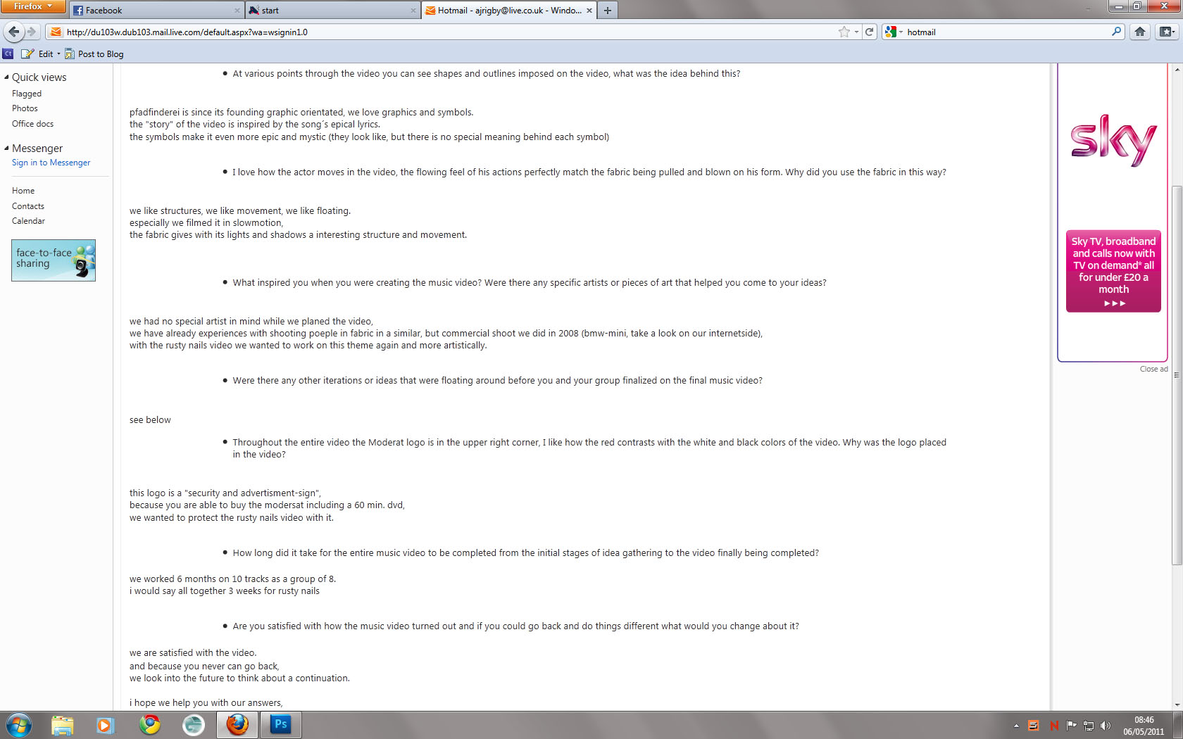
The production group who made the video is called 'Pfadfinderei' and the Director of Photography is Max Penzel. I have looked on the internet for any interviews or information about the concept and design for Rustly nails but so far I have found nothing. I will however send a messgae to the Director and hopefully get a response and some information about the design process. I have come across a problem as most of the ways to contact him are either by phone or fax, however it is in german. Still i will send an email and hopefully get a response.
With a little searching and research I have found out that Max Penzel does infact speak English and his page on the website www.alivenotdead.com has more information about the director.
http://www.alivenotdead.com/maxpenzel/details.html The directors page on the website.
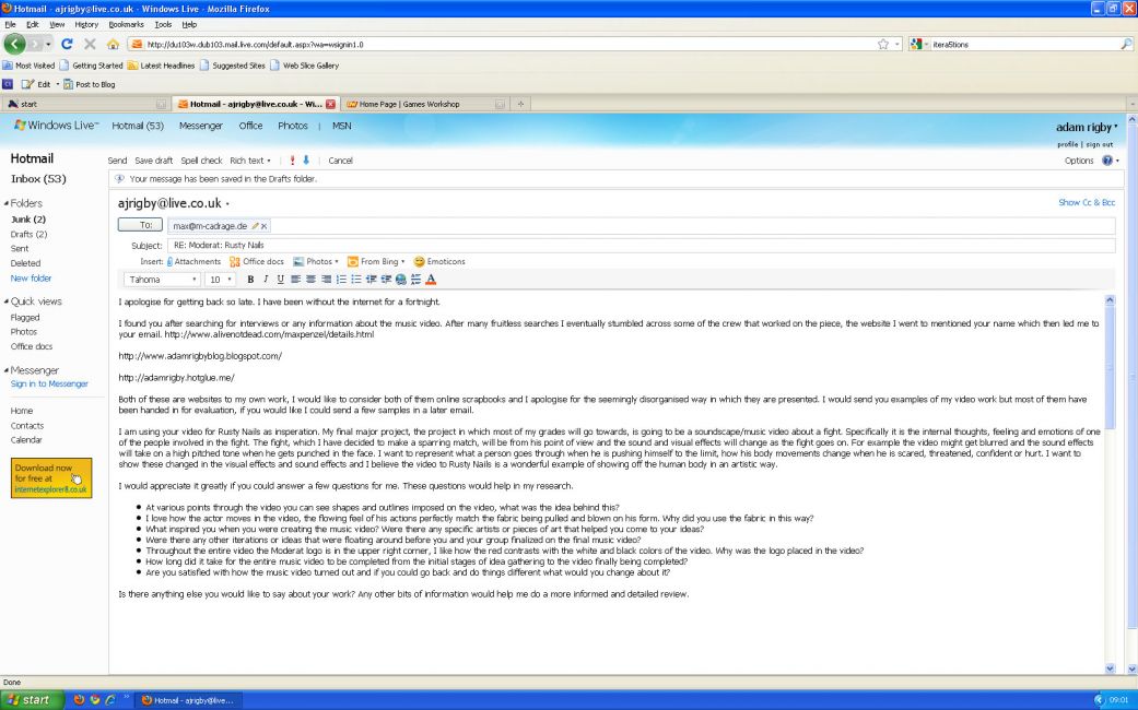
After a while I finally got an English response! I was very surprised to get this, I thought after a while that I would not recieve any other reply at all. However an email came through that answered all my questions.
The answers were interesting. Instead of having a complicated or artistic message within the piece, as I originally thought, they simply did what they thought was good and what they enjoyed.
Ive been thinking about my own piece and instead of forcing in some high brow politicol or artistic message im simply going to do what I want but im going to do it well, I think that's the only way ill make a good piece.
LOCATION
Ive been thinking about where to shoot my piece and while I have thought of many locations there have only been 2 themes among them which I can catogorise into 'Clean' and 'Dirty'.
Clean places would be like the Cove; White, well lit and clean. This would give the feel of sparring instead of fighting, making it more 'surgical' and 'sterile' in look and feel. Well lit places would also work like halls, I have thought about using the lecture theatre because that is where I used to have my kick boxing lessons.
Dirty places would be things like basements, outdoors and fields. This would reflect a more gritty fight than a sparring match. I have thought of using the basement of a classmates flat because it is being renovated but all the stonework of the walls is bare and the floor is all concrete and brick. If I places down some cardboard boxes then it would be like 'Fight Club' and I liked the look of that movie, very gritty and almost graphic novel-esque.
I have decided to use a cleaner location like the cove, the gritty setting of a brick work basement or other such area but it will be harder to light and control the mise en scene.
STORYBOARD
The first shot will be an establishing shot of the area the fighters are going to spar in. The camera will zoom out very slowly to show the scale of the area, or at least make it look bigger.
The next few shots will be very quick in succesion. The fighters will be preparing for the fight, tying up shoes, strapping on gloves, stretching and ghost sparring. The sound effects at this point will be highly exxagerated, for example when the fighters are stretching the sound of rope and leather stretching will be placed to show the strain and to put a little more impact into the motions but also to show the audience that the fighters have real power, even though the actors may not seem to be very fit, athletic or strong. This may give the shoot a more comic book or video game feel.
The next shot will be of one of the fighters sitting down, hands slumped in between his legs, head bowed down and his breathing heavy. The camera will then pan to the side and zoom out as the fighter gets up and gets into position. The camera will finish with both fighters in position, both in their respective stances and staring at each other. At this point the sound effects will be silent.
Then both combatents will race towards each other with a single punch, both fists connecting. This is to show the audience that both combatents are equal in skill and strength since neither opponent back away from the strike and the duel punch does not lead to any injury.
I was still not 100% sure what to do next until i actually got down to the location.
LOCATION
By the way I managed to grab a hall as my location, since it was built to be an add on to a church it had a nicely arched ceiling and a nice combination of both 'dirty' and 'clean'. The ceiling had lots of windown so that let in light quiet nicely although im sure in the final footage there are inconsistancees between light levels, however due to the time limits that had began to creep in I was unable to do anything about that. It was simply bad luck that I happened to film on a cloudy day.
STORYBOARD CONTINUED
There was one scene I wanted to do for the fighting. It involved one character being pushed back or rather punched or thrown a fair distance away. the character would get up and with no concern to his own health he would tackle the other opponent and deliver three solid punches to his kidney area. I wasted the first two to be fast and violent with the final punch slowing down so the sound effects could seem more visceral. The punch also twists at the end of the third punch making it more brutal.
After that the person who got tackled, Im going to call him B for simplicity when explaning the following scenes. The other actor who will be the victor will be called A.
After A punches B in the kidneys B will then deliver a sharp elbow drop, or punch, to the back of A's head forcing him to back away. After a push, or perhaps another punch, A will fall back and as he gets up he will shake the damage away. i will blurr the screen after the blow and unblur it once A has shaken it off.
I will splice shots of them both realing from the attack since B also took heavy damage, he will take many steps back whilst cradling his left side. once he reaches a certain distance he will get back in his stance and seemingly shake the damage off.
Then i will have both A and b come together for a small flurry and exchange of blows in which they block, dodge and take a few hits. I wanted a block, dodge and hit to be clearly shown whilst the camera pans around the combatents keeping them both in frame. I believe this will be slightly disorientating to the audience but this is what I want to achieve. To reflect the haphazard nature and confusion of a fight I want the audience to be disorientated and maybe even confused as to whats going on, to an extent.
After these flurry of blows i want B to humiliate A and this will go into the final scenes. B will block and grab a punch from A, whip him downwards to throw him off balance then deliver a punch to A. By the act of whipping A will try and stand up again but this will leave his legs twisted since he did not have enough time or space to adjust his stance, this will ensure that when b punches A he will spin as he falls.
A will fall on to his back and seemingly he will be defeated, the screen will slowly fade to black and perhaps I will even have credits start to scroll. However A will get his second wind. he will see red and will now care little for his own safety, he will drop his stance and simply want to hurt his opponent. Getting back up he will sprint over to B. As he gets up he will simply leave the shot because the camera will be static. The next shot will be a left punch which will be shot from the left side of the screen which will break through the guard of B.
The next punch will be shot from the right and a right punch will be launched from A. Since the first punch will be so shocking or surprising to B he will not bring his guard up quickly enough and the punch will directly connect.
The next punch will be a hook coming from the left and shot from the left with the following shot being a right hook shot from the right. The hooks will have more power and slightly spin B off his balance. The right hook will actually spin B, but as he spins around he will try and land a spinning punch which misses because at this point A will come in close, grab the back of B's head and deliver a knee to the chest.
This is a great oppurtunity to have a particuarly gruesome and brutal sound effect, I was thinking of having the sound of bone crunching. The shot will slow down and zoom in on the knee to make it as brutal as possible.
The next shot will be interesting and I hope it will be effective in putting the audience off balance. As A spins B around whilst holding the back of B's head the camera will not only quickly pan to follow the fighters and stay on the same side but the camera will also be tilted at a 45 degree angle. Done quickly this should disorientate the audience and make them feel as if they are being spun around.
Another knee will connect with another zoom on the area afflicted. I want the screen to have a tiny amount of shake with each punch connected to make them seem more brutal and to make the audience feel the power of each shot.
After the knee A will use his upright knee as a fulcrem and as he pushed his knee back he will bring his head forward in a headbutt which will connect with B's forehead, sending him sprawling back on the ground. For the sound effect on the headbutt I wanted something comical as well as satisfying. I was thinking of the sound of a sledgehammer hitting an anvil, this will be in contrast to all the other more organic noises which will emphasis the strength of the headbutt.
After B falls back he will have one last attempt to get up, putting his guard up around his face. However A will simply deliver a kick that will power through B's guard and send him to the floor once again. I could end it at this point however I have filmed more scenes afterwards.
The next shots are of A going down to B, grabbing his shirt and seemingly ready to deliver more blows however B will scramble back and call a time out. the fight will be over then and A and B will clasp hands to show a little ritual behaviour after a fight, they will then both leave the screens at opposite ends. The credits will then roll and fade to black.
However as soon as the film ends the final scene will show when both combatents go into the fight again, running from opposite ends to deliver a final blow to each other, the screen will snap to black just before the outlandish blows connect.
CONCLUSION AND THOUGHTS ABOUT WORK
I am, to be honest disapointed at myself for the quality of the shots filmed and the ideas that were forced to be made. I had recieved distressing news a week or so before filming so this threw me off my work greatly, directly impacting the shooting and works thereafter. I find the shots to be too simple and not thought out enough, the lighting was all wrong to how I envisioned and I just find the work lacking to how I wanted it to be.
I originally wanted to have the screen mostly black with only the fighters lighted, but this was not to be as time constraints forced me to do other things to ensure the work would actually be completed to some degree. the shots themselves did not come out as I wanted to either, mainly because I had another person filming and at the time communication between us was poor and also I had a personal issue to resolve later that day so I was limited to only a few hours of filming. Also my cameraman invited someone to our shoot and while I did not complain I was honestly in the mood to start shouting at my cameraman.
However these faults can be blamed on me, or rather I blame myself for not being more of a director. The other person 'added' to my crew was a distraction however at this point I was too tired and frustrated to do anything about it. I wish I had more time to go back and film more scenes under more controlled conditions. I wish I had laid down the rules to my cameraman and 'additional' crew.
As of my writing I have yet to collect the sound effects and edit my film, the hand in date is barely a week away but already I feel my motivation dwindling and my energy being sapped at the prospect of handing in something sub par.
I will simply do what i can and take on these experiences into my future work.
A slew of technical difficulties has prevented me from doing much work. For example the computer I originally decided to save my work on has no sound capabilities whatsoever, this made it impossible to cotninue my film in any way. I then managed to track down a portable hardrive to put my work on a different computer. On this computer it seems like Premier pro does not want to work.
I should have begun filming and other such tasks weeks ago to saver myself all this trouble. I ended up taking a week of any serious work due to personal problems however I should have begun production before this happened anyway. All in all I am disapointed at myself for even allowing the half finished product to be handed in, I hoped for so much more to be done and to be realized. I recognize where I went wrong however and I will reflect upon this so that in the future I will plan out my projects as carefully as possible and start work as soon as I can to ensure that any problems are kept to a minimum.
While I do not like to blame others I do think that my choice of cameraman and actor may have contributed to the problems. Not because these people are sub par at their job, but more because I am too familiar with them and this caused me to refrain from telling them what to do and I more or less let them direct the shots. This is my failure as a director, I should have been more in control or at the very least worked with people whom I had worked with little before.
It is such a shame to me that I had to end my educationel years on such a let down.

FILM PRODUCTION HOUSE LOGO.
I will be designing a film production logo for a fictional company that I will use for my FMP.
The basic premise is I will have a person, with their face obscured by shadow in post production and in shot, who is making obscure movements and gestures with short, 1 second or more pieces of footage edited together. He will make a sweeping motion with his hands, as the first hand waves past the screen the name of the production house is revealed and the footage is slowed down for a bit so the audience can read the logo and typogrophy. Then as the second hand waves past it wipes away the footage leaving a black screen.
The soundtrack will be similar to the opening credits of Se7en, which uses the song Closer by Nine Inch Nails. A choppy edit of various sounds that create a sinister soundscape. I wanted to use things like whooshes, heavy breathing and other heavy sounds like the ones on the Se7en opening soundtrack. I may even use the song Closer but edit it heavily to create something more original.
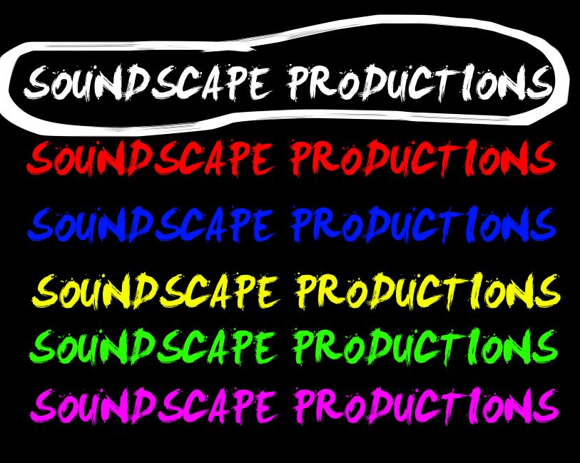
I have been thinking about what the production company would actually be about, what their work philosophy is and what kind of stuff the company would be working on. I came up with an initial idea for the name, something to hang my work on for now. I will use 'Soundscape Productions'.
The idea behind Soundscape is that it is a production house that creates music videos and low budget independant films. Some themes came to me while I was thinking, the sense of collaborative work was one that was at the forefront. Since this production house would create low budget films and so forth collaborative efforts would need to be made to create each piece of work.
I was thinking about how long the piece itself would actually be, usually when you watch films you see the logos of the smaller production houses the logos and animations usually last between 10-20 seconds however I think my piece will be effective within the lower time frame of 5 to 10 seconds long, I think this will be a good length and it gives me a little bit of a restriction to the work, I wont make a massive epic piece, just something very simple and hopefully effective that people will remember and hopefully the logo will stick in their head.
When thinking of the typogrophy and color scheme I need to be careful about how the audience will percieve this, not just the casual viewer but also people looking to hire the production house for work. I will probably use a brush type or spray paint font to give forward the impression of low budget work, the waving motion of the hands that reveal the letters will make it seem like they are being sprayed or painted on to the screen as his hands move past. However I want to stay away from anything that looks like graffiti.
After the second hand has waved past the screen I want to leave the font untouched so it would be blown up on the big screen for everyone to see, then the image would fade out to the next company logo or even the production itself.
I had to really think hard about the color scheme, not only because I need to convey what the company is about but also an appropriate color so it stands out against a black background, my choices were red and white but in the end I went for white. Red tends to blend into black sometimes and also it can tire your eyes out looking at red, also the bright shock and themes of red were not what i wanted the company to be associated with; Blood, gore, pain, danger and so forth.
After looking at the image in photoshop, as well as a few other colors I decided to use white.
LOOK AT E4/TV STINGS